|
|
Sotw 25
Oct 28, 2005 16:51:09 GMT -5
Post by matthew on Oct 28, 2005 16:51:09 GMT -5
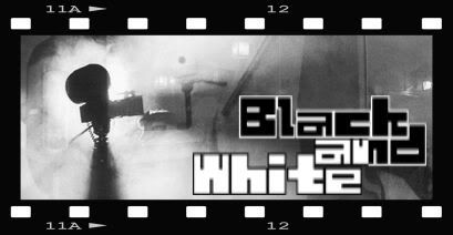
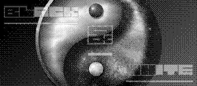
Theme: black and White Colour: black and White Text: black and White Font: Maze black and WhiteSubtext: optional Size: Optional Have Fun ;D |
|
|
|
Sotw 25
Oct 28, 2005 17:08:21 GMT -5
Post by James on Oct 28, 2005 17:08:21 GMT -5
This should be good!  |
|
|
|
Sotw 25
Oct 28, 2005 17:34:34 GMT -5
Post by James on Oct 28, 2005 17:34:34 GMT -5
Heres mine.  |
|
|
|
Sotw 25
Oct 28, 2005 17:42:53 GMT -5
Post by matthew on Oct 28, 2005 17:42:53 GMT -5
hehe, that's awesome  and very quick, i might add  |
|
|
|
Sotw 25
Oct 28, 2005 18:20:33 GMT -5
Post by Crippled Munchkin on Oct 28, 2005 18:20:33 GMT -5
missed last week, but i got one for this week...  |
|
|
|
Sotw 25
Oct 28, 2005 18:34:05 GMT -5
Post by guardian on Oct 28, 2005 18:34:05 GMT -5
what is up with the inverted side...? i would have just left that side plain with black fog. still good though.
|
|
|
|
Sotw 25
Oct 29, 2005 3:41:40 GMT -5
Post by James on Oct 29, 2005 3:41:40 GMT -5
That font has to be 30px to work.  |
|
|
|
Sotw 25
Oct 30, 2005 1:20:23 GMT -5
Post by matthew on Oct 30, 2005 1:20:23 GMT -5
here's mine ;D  |
|
|
|
Sotw 25
Oct 30, 2005 4:49:15 GMT -5
Post by James on Oct 30, 2005 4:49:15 GMT -5
Very weird. I never really use the arrow shapes in photoshop. Good idea. You'll be having my vote  |
|
|
|
Sotw 25
Oct 30, 2005 14:32:52 GMT -5
Post by lostsoul on Oct 30, 2005 14:32:52 GMT -5
me to  however i like the clip in mmj's sig lol  |
|
|
|
Sotw 25
Oct 30, 2005 18:48:37 GMT -5
Post by matthew on Oct 30, 2005 18:48:37 GMT -5
well the comp is not over yet. hopefully we'll get some more smashing entries  The arrows are actually selections. I made the sig, duplicated the layer and then made a negative image, and then with the selection tool, i cut out the arrow shapes to reveal the original image beneath  |
|
|
|
Sotw 25
Oct 30, 2005 19:47:48 GMT -5
Post by admin on Oct 30, 2005 19:47:48 GMT -5
Here's my siggy.   |
|
|
|
Sotw 25
Oct 31, 2005 10:56:19 GMT -5
Post by lostsoul on Oct 31, 2005 10:56:19 GMT -5
wow these are all so good so far  The arrows are actually selections. I made the sig, duplicated the layer and then made a negative image, and then with the selection tool, i cut out the arrow shapes to reveal the original image beneath
i like that  i might try it some time  |
|
|
|
Sotw 25
Oct 31, 2005 16:45:53 GMT -5
Post by James on Oct 31, 2005 16:45:53 GMT -5
i like the clip in mmj's sig lol  Thanks.  |
|
|
|
Post by SOTW Guest on Nov 4, 2005 0:19:18 GMT -5
Eh, I am not too keen on this, and I don't even know if you will accept it, as I am only a guest. What can I say, I was bored and had nothing to do.  Those were pretty cool rules for a SOTW, unique indeed, but they were pretty tough, atleast for me.  |
|
|
|
Post by matthew on Nov 4, 2005 0:24:34 GMT -5
That's awesome, Thanks for entering!  |
|
|
|
Sotw 25
Nov 4, 2005 14:37:44 GMT -5
Post by bethany54 on Nov 4, 2005 14:37:44 GMT -5
hmmmmmm Maybe this would be a good place to start.
Canceled Bad idea because I can't even see the "n" or "w" until it is huge.
|
|
|
|
Post by Planetslick on Nov 8, 2005 3:37:52 GMT -5
Heres mine,  |
|