|
|
Post by Michael on Nov 23, 2005 22:17:23 GMT -5
Shan and M@, I've noticed that a lot of your siggy's (mainly the Lost and LOTR ones) text matches the siggy's bg wonderfully. And when I place text in mine it's not so. . . blendy, I guess you might could say. Could ya'll give me some pointers on how to improve my text? Thank yas greatly!
|
|
|
|
Post by admin on Nov 24, 2005 1:38:35 GMT -5
one thing that I do to match my text well with the background is look at the background and colour pick a colour from it. And how you do that is click on either the foreground colour or background colour in your materials palette and go to your siggy and click on one of the colours there. That should work. Also, I've been taking tutorials on how to do text in better ways and things, too, which always helps.  Also, I play around with the opacity and add different effects like inner bevel and drop shadow and some distortion effects as well.  |
|
|
|
Post by Michael on Nov 24, 2005 10:27:44 GMT -5
Ah. . . didn't know you could do those, hehe, now I do. Thanks. Where are those tutorials at?
|
|
|
|
Post by matthew on Nov 24, 2005 11:40:43 GMT -5
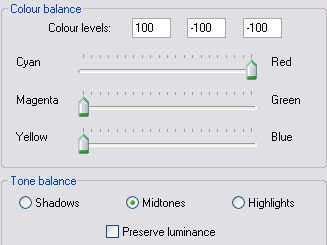
I do the same as Shan  I also use colour balance a lot to blend stuff esp' text and images, with the background. To demonstrate, I'll use one of Shan's pre-made grunge sigs ;D  I colour pick from the siggy using the Dropper tool  (in the tools palette).  a left click with the mouse will set the colour for the foreground and stroke properties (The top colour box), which will be the outline of the text, so i have colour picked some of the dark green from the sig. a right click will set the colour for the Background and fill properties (The bottom colour box), which will be the main text colour, so I have colour picked a light green. I then added the text, and merged ( Layers > Merge > merge all layers), then duplicated ( Layers > Duplicate)   with the duplicated layer highlighted in the layers palette, I went to Adjust > colour balance > colour balance, and made these settings.  Which gave me this  With the duplicated layer still highlighted, I selected the Eraser Tool  in the tools palette, And set the opacity to 10, and erased some of the text on the left to reveal the original green colour beneath.  I then merged all layers |
|
|
|
Post by Michael on Nov 24, 2005 12:20:11 GMT -5
^_^ Muchas gracias senor! THANK YOU SO MUCH!!!!!!! That helps a lot you two!
|
|