Post by matthew on Dec 3, 2005 7:29:27 GMT -5
Short tutorial about creating forum colours[/b]
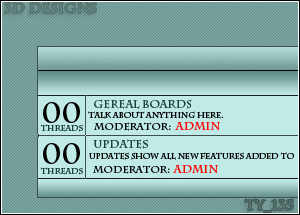
Although it's not always easy to come up with the magic needed to create something striking, I always start to create a template like this. I believe this is a very easy way to make a template, and anyone can do it. It is pretty easy and straight forward, even if the end result looks very impressive, it's really just a combination of all the elements working together, rather than any skill on my part.
I open up this image in Paint shop Pro. I call it my Proboards canvas. i try out all my colour ideas on it, and use it a lot. i find it easier and less hassle than adding in hex codes again and again directly into a forum until i come up with something that looks half-way decent.
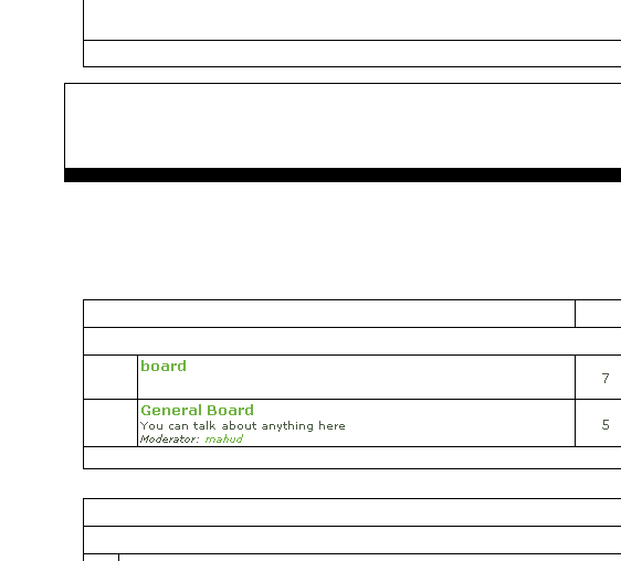
First i start of with the background colour. This is my mid-range colour
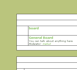
I then choose a much lighter colour for the window backgrounds.
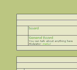
i then click on the background colour and chose something darker for the border, usually something that stands out well, but doesn't make the boards look overly boxy.
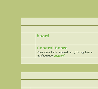
And that's the major colour scheme sorted out. It doesn't take very long for me if i following the above pattern. It doesn't look much yet, but it's amazing what a few gradients can do
Now for the title and cat images. This can take a bit longer.
For the title bar I'm going to go for a glassy look. and for the cat bar I'm just going to have a simple dark to light gradient with a highlight.
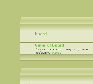
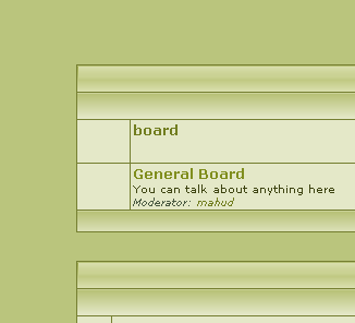
for the link Colours I'm going to make things easy and continue on with the green. I don't want it to be too light, otherwise the links will be invisible where they appear on the background, but i want it to be light enough to be distinguishable from the normal text colour
For the text colour i use a very dark green, something that's guaranteed to be readable on a light background. Basically it looks black.
I then do something with the background using the selection tool and basic gradient and pattern fills, highlights and a bit of drop shadow.
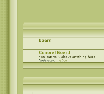
and that's it. the beginnings of a template
Although it's not always easy to come up with the magic needed to create something striking, I always start to create a template like this. I believe this is a very easy way to make a template, and anyone can do it. It is pretty easy and straight forward, even if the end result looks very impressive, it's really just a combination of all the elements working together, rather than any skill on my part.
I open up this image in Paint shop Pro. I call it my Proboards canvas. i try out all my colour ideas on it, and use it a lot. i find it easier and less hassle than adding in hex codes again and again directly into a forum until i come up with something that looks half-way decent.

First i start of with the background colour. This is my mid-range colour

I then choose a much lighter colour for the window backgrounds.

i then click on the background colour and chose something darker for the border, usually something that stands out well, but doesn't make the boards look overly boxy.

And that's the major colour scheme sorted out. It doesn't take very long for me if i following the above pattern. It doesn't look much yet, but it's amazing what a few gradients can do

Now for the title and cat images. This can take a bit longer.
For the title bar I'm going to go for a glassy look. and for the cat bar I'm just going to have a simple dark to light gradient with a highlight.

for the link Colours I'm going to make things easy and continue on with the green. I don't want it to be too light, otherwise the links will be invisible where they appear on the background, but i want it to be light enough to be distinguishable from the normal text colour
For the text colour i use a very dark green, something that's guaranteed to be readable on a light background. Basically it looks black.

I then do something with the background using the selection tool and basic gradient and pattern fills, highlights and a bit of drop shadow.

and that's it. the beginnings of a template


