|
|
Post by noman on Mar 15, 2007 12:32:12 GMT -5
This is how I created my bottle in Paint Shop Pro. 1) First, I created a new layer, made a rounded rectangle selection, and floodfilled it with colour. 2) I wanted the selection to be in the centre of the canvas, so I cut and pasted it as a new layer. Note: all images are at 50% 3) 3) I then selected warp, and made these settings: - Horizontal: 0
- Vertical: -45
- Size: 45
- Strength -55
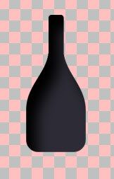
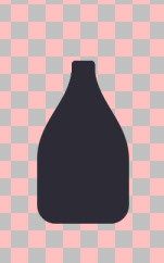 4) 4) Next, I created another layer, and made a second rounded rectangle selection for the neck of the bottle, Floodfilled, and merged the two layers. 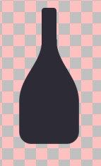 5) 5) Next, I wanted to give the bottle a 3dish look. I duplicated the layer, and selected the cut out effect with these settings: - Vertical: 30
- Horizontal: 25
- Opacity: 80
- Blur: 40.00
 6) 6) Next, I wanted to create a glowy highlight effect. I created a new layer, made a narrow rectangle selection almost the same height as the bottle, floodfilled it with white, and positioned it to the left. 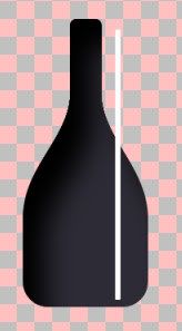 7) 7) Then, I selected Gaussian Blur with a Radius of 8.00. I then selected Warp, using the same settings as above.  8) 8) Almost done now. Just need to add some labels. First, click on the Raster2 layer, and create a new layer. Then, select the rectangle select tool, and make a couple of selections for the labels, and Floodfill them with colour. 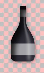 Add some dropshadow, some text and a funky background, and you are all done  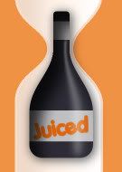
Did you create your bottle differently from mine? Please post your method below ;D |
|
|
|
Post by Michael on Mar 15, 2007 19:17:33 GMT -5
Alright! I had a go at this as soon as I saw it!
I first started out with a 400x400 image and made a quick background. New Raster Layer. Then I make a Rounded Rectangle Selection and made is so and so height and width. Floodfilled it with a gradient. 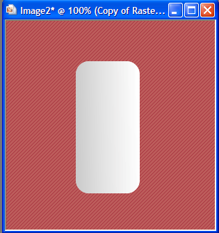 Then with that layer selected, I went to Effects > Distortions > Warp.Settings:Horizontal: -4 Vertical: -85 Size: 54 Strength: -59 Click okay. Erase the top piece. Go back to Warp and make these settings: Horiz.: 0 Vert.: 30 Size: 54 Stren.: -11 Click okay.  Back to Warp. Horiz.: 0 Vert.: -19 Size: 34 Stren.: -19 Click okay.  Now, using the Warp Brush, I clean up the sides a bit and make rivets around the top of the bottle.  I add a label for the bottle [through the rectangle selection tool] and text for the brand name and such. 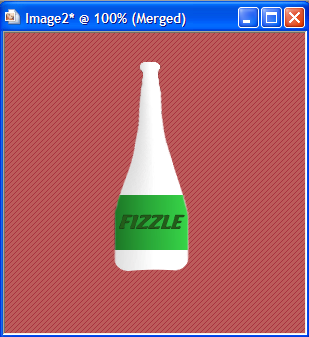 Then I add a shadow for some kind of effect. ;] And I do more with the background. 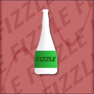 THE END!
lol. So maybe I have bumps in the bottle. lol. It's airbubbles. ^^ |
|
|
|
Post by savedbygrace on Mar 15, 2007 22:34:19 GMT -5
Very nice, guys.
|
|
|
|
Post by noman on Mar 17, 2007 22:37:21 GMT -5
Your bottle look's great, Michael. I love the detail and extra touches, and you created the bottle shape in less steps than mine too ;D. Good use of the warp effect.
|
|
|
|
Post by Michael on Mar 18, 2007 13:09:22 GMT -5
Yes, I did have less steps but I think you're bottle looks so much better. But thanks. I learned some stuff when using the warp effect, so I'm happy. ^^
|
|
|
|
Post by shanny on Mar 18, 2007 17:33:03 GMT -5
For my bottle, I used mostly the selection tool and deform tool. And then added highlights and texture effects to it. 1. I made an ellipse with the selection tool. More long than wide. 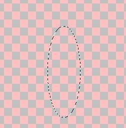 2. Then I deleted the bottom and top of the ellipse holding down the control (ctrl) key while using the selection tool. 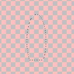 3. I filled the selection with a brown colour (#7f665b). I added a new layer. Then I wanted to add a bit more of a rounded bottom to the bottle, so again I used the selection tool and added a ellipse and needed to delete some of the ellipse to added a more round (just messing around till it looked right  ). and added the same colour of brown to the selection. 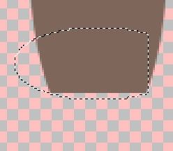 4. Merged the layers together and then used the deform tool and by pressing the control key at the top nodes, I deformed it so that the top of the bottle was a bit narrower than the bottom.  5. Now for the top of the bottle. Made a new layer. And then, I did the same as above except used a rectangle selection and deformed it. 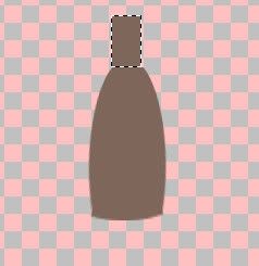 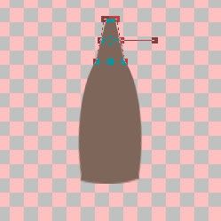 6. I basically have the shape of the bottle now. Then I just added a few touches to it. I added a texture to the bottle contents. I went to Effects > Texture Effects > Texture and added these settings. 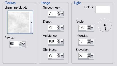 I lowered the opacity to the Bottle layer to around 52%. 7. Then, I duplicated the bottle twice. First duplicated layer, I went to Effects > 3D Effects > Cutout and added these settings.  And then lowered the opacity to 40%. And the 2nd duplicated layer, I did another cutout effect with these settings. 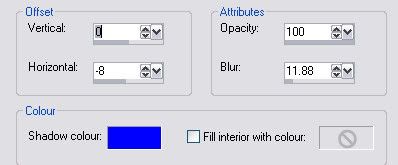 And lowered the opacity to 15%. 8. I added a few highlights using the selection tool, the colour white and gaussian blur. One rectangle down the center and the blur at about 10 and then a couple on the side with the blur around 8. Also added one at where the head of the bottle and body of the bottle is with a brown colour to give it a bit of a look of indentation. 9. I added the colour #FFF0CC to the background. So, the bottle kind of has a clearish look to it.  And this is how it turned out  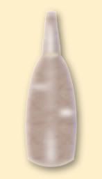 |
|