Bisurge
Student
 Hydralisks Own
Posts: 47
|
Post by Bisurge on Feb 15, 2008 1:37:17 GMT -5
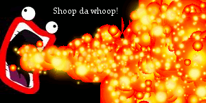
In a world... Where people fire their lazers... One googly-eyed internet meme... Stands above the rest! SHOOP DA WHOOP! Here is a signature dedicated to Shoop da Whoop.  Feel free to go on ahead and take it. However, do not credit yourself for the creation of it. Also, please know this has been made with GIMP, which already had the sparks brush and pencil ready. Pencil was used for the explosion effect, sparks was used for finer details. Computer graphic card may change the picture slightly, but you should still be able to see mostly what it's made of. |
|
FEAR
Student
 Only way to defeat fear is to accept it
Posts: 6
|
Post by FEAR on Jul 24, 2008 2:58:28 GMT -5
Nice work.
|
|
kisa
Student

Posts: 1
|
Post by kisa on Sept 3, 2008 15:27:42 GMT -5
nifty
|
|
|
|
Post by Andrew on Sept 3, 2008 19:53:56 GMT -5
Pretty basic tbh.
|
|
|
|
Post by Jordan on Nov 23, 2008 11:55:51 GMT -5
Yeah... not really much. put something in the background? Need more grads? idk just needs more to it.
|
|
|
|
Post by Michael on Nov 28, 2008 11:31:14 GMT -5
(I just stopped by while on break to see how things were going and I decided to look around too... ;] ) Bisurge: The siggy looks great, as I know how GIMP can be. I think you have put great use to the tools and effects that are available through the free-ware program. I noticed a few things though. In your actual signature you have two siggies that are 300x130, which is a great size and appeals to the eye, because the main focus of the siggies are in the middle with a great background. I compared the sizes and saw that the one for Shoop Da Whoop was 300x150. I think that if you were to extend the width by 50 more pixels, it would appeal more to the eye. Also, if you move the lips, whom I assume to be Shoop Da Whoop, closer to the middle, the focus would be more clear. As for the background, I think it is fine. However, if you want to add more flare to it, you can do a grey brush technique on the black. You can do this by using another layer, use the brush tool in grey and randomly brush the layer. Then use a crazy affect and change the opacity, so that it blends more. The text will be fine in white; however, I think you would benefit from a visit to dafont.com, where you can download a ton of free fonts that look amazing! ;] Overall, good job! Using combinations of tools and effects as you have in this siggy in only the beginning of becoming a great graphic designer. But I think you will go far. ;] |
|