Bisurge
Student
 Hydralisks Own
Posts: 47
|
Post by Bisurge on Dec 5, 2008 1:06:10 GMT -5
Okay, don't come running on in here saying "your pictures suck" because I made these almost exclusively with GIMP (using www.planetrenders.net/), and MS Paint if I had to do some fine editing. Most Recent:  Christmas:  WTF?:  And of course, the ones on my signature. Note: This thread will be edited often. |
|
|
|
Post by Michael on Dec 8, 2008 23:52:16 GMT -5
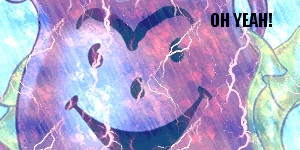
Wow, I can tell you love to use lightening backgrounds. :]
I think that you really great making these siggies. I particularly like the Santa Clause one. I think that the edges of the render could have been more cleaner (which can be done by zooming in and using a low opacity eraser), but the background looks spectacular. I love the snowflakes in it.
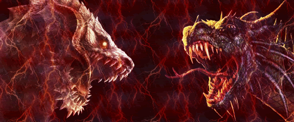
The two dragons remind me of the Dueling Dragons ride at the Islands of Adventure in Orlando, Fl. Haha. I think you made this one really great as well. The background is a little patterned, which can be boring unless you use it to accent your focus (the two dragons), which you did. I personally think that it could have been done better if the opacity of the two dragons were not so low. Actually, I think it would have been better to change the color tone closer to red, not completely though. This way the two images blend better with the background. A border would also capture the eye quicker and direct the focus.
I've noticed that the only way you've been formatting your text is through color. I haven't used Gimp is a while, but what I tend to do in MS Paint is to overlay. For instance take midnight text. Then, using the same font and same word, but in a lighter shade of blue, and it looks like a shadow.
In MS Paint, you can also make gradients by going to Colors >> Edit Colors. Choose whatever color and look at the Red Green Blue numbers. For instance, I am looking at neon blue and the color number are as follows: Red 95 Green 244 Blue 252. To make the color brighter or darker, change each at a consistent interval. The RGB colors would change to 105 254 255 (because 255 is the highest, because at 255 it becomes white) at an interval of 10. The next step would be 115 255 255. Then 125 255 255. And then you would do it backwards if you wanted a darker shade of neon blue...
Anyways, overall, you are doing great. ;] You should look up some tutorials here by Aled. He used Gimp as well and became very proficient.
|
|