|
|
Post by matthew on Dec 27, 2005 13:21:10 GMT -5
An alternative banner for the Orphical dawn xigna blog template. It's a bit rough, but better than the original i think. link |
|
|
|
Post by bethany54 on Dec 27, 2005 19:23:21 GMT -5
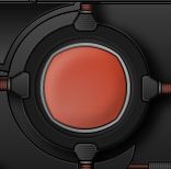
Mahud that red circle looks a bit one dimensional against eveything else. How about putting one of your orbs there to finish it off.
|
|
|
|
Post by matthew on Dec 27, 2005 21:04:55 GMT -5
I could do. it might be a bit tricky though, because i merged the layers for that part of the image and the pipes coming off it. I'm not sure how many layers it took me to make it but it currently has 24. was kinda forced to merge stuff because it was getting confusing ;D EDIT had a quick mess around with it. and i managed to give it a more 3dish look. not really spherical though.  do you think that would add to it, or does it look a bit naff? |
|
|
|
Post by Michael on Dec 27, 2005 22:45:04 GMT -5
Hmm... I like it but I like the v1 better. I have no idea why. But I do like this one. Great job.
|
|
|
|
Post by bethany54 on Dec 28, 2005 0:28:52 GMT -5
No clue what naff means but I do like the red part better now.
|
|
|
|
Post by matthew on Dec 28, 2005 9:02:57 GMT -5
hehe, 'naff' just basically means a 'bit rubbish'. Something that is lame.
|
|